5 simple tips to improve your slides
I gave a talk at work where I gave some general tips on how to compose presentation slides that stand out and make an impact. Slide design has always felt important to me. I enjoy investing time in personalizing them and I look closely at other presenters contributions for inspiration.
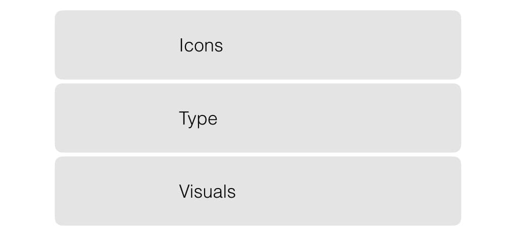
For this brief guide I wanna cover 5 topics:
- Icons
- Color
- Typography
- Visuals
- Experiments!
1. Icons
Making the case for how powerful icons can be to enliven your slides is pretty simple. Just take a look at the example below:
As you can tell I haven't used any color or special fonts when I designed these slides. The only difference is the use of icons. And it makes all the difference.
I have an idea why. When you put icons and text next to one-another you force the brain to process the information and decide what the connection should be. This mental exercise activates you and makes the slide more memorable and engaging.
The best resource for icons
There's one website I always return to for high quality icons: The Noun Project. They aim to collect icons for all nouns in the English language but has since expanded to verbs, adjectives, etc. etc.
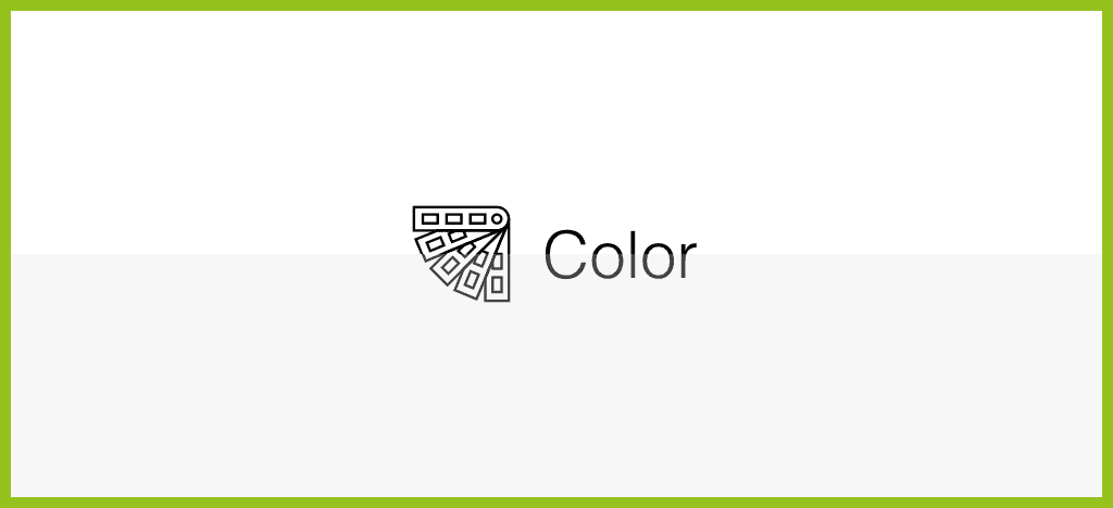
2. Color
Most slides place black text on white background. This combination creates the strongest contrast you can imagine. Especially if you have a good projector with a bright lamp this creates a problem: it's unpleasant to look at. The same problem exist on any screen. It's therefore a good idea to avoid 100% black and 100% white. The result is subtle but make a lot of difference - compare below:
That said, don't forget that you have unlimited colors to choose from! You don't have to do anything complex - just be bold and start by trying out a solid colored background:

The best resource for colors
Google has put together a very nice color palette for their design framework Material Design. There's a nice tool that will help you pick colors and play around with different hues: materialuicolors.
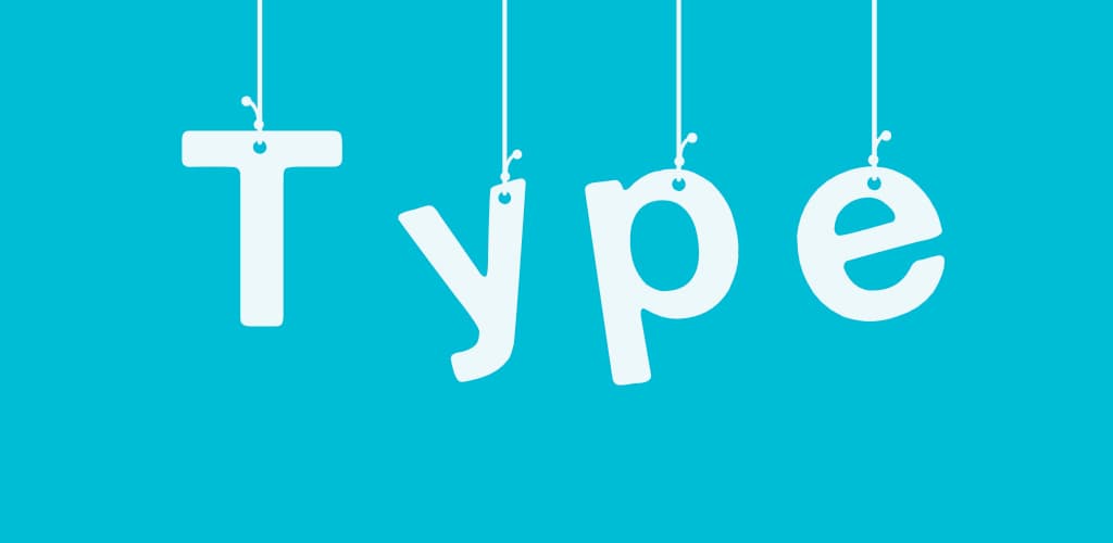
3. Typography
Rule: Never use the default font! It's likely not the best choice and is a dead giveaway that you haven't put much effort into your slides - so why should your audience? There's already a bunch of font pre-installed on your system so just play around with some options!
When you've found a good-looking, fun, expressive font there's one more step you need to take: make it BIG! This goes back to doing what's possible to make your slides stand out - be bold! This will help make people remember your talk.
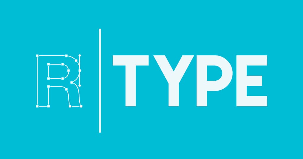
The best resource for fonts
An "old" website that stands the test of time: Dafont literally has thousands of categorized fonts - you'll find plenty to choose from! I like to browse around and download ones I like, not always knowing what I'll use them for but then I can always experiment.
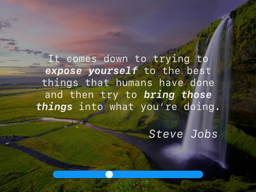
4. Visuals
You can come a long way combining icons, color and typography but sometimes you want to give a slide a little extra punch and there's no better option than to use a photo background. Maybe you find one that will great with an inspiring quote.

However, as you can see the contrast between the text and background now is a problem 😕 . What I like to do in these cases is add a back box on top of the image and play around with it's opacity until I find a nice balance:
The best resource for images
Unsplash is a great website with free, and I mean free as in public domain, photos of very high quality. It's far from "stock images" syndrome. You can also sign up for a weekly newsletter for a stream of very nice inspirational pictures.
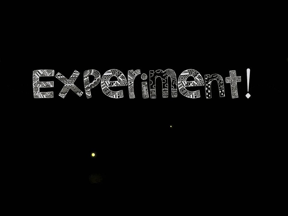
5. Experiments
You never know where you might find an interesting presentation asset. Keep a look out for YouTube videos, comics, gifs that catch your interest. I came across a cool website providing video backgrounds where I found this interesting piece:
Collect assets right now! If you find a nice font browsing Dafont or a stunning image on Unsplash - download and save them to your collection. That sets you up to do experiment with different combinations and colors and fonts without having to start from scratch every time.
Good luck designing your next presentation 😊 Spend a little extra time adding a splash of color or picking a non-standard font - the difference will be noticeable!
I've exported my original presentation to a bunch formats for you to use as you wish. You can download them from my Google Drive. Do Remember to properly attribute icon authors!